For the final post in our three part series on principles of voice design, I'll discuss what may be the most substantial difference between voice user-interface design and traditional visual user-interface design. This different can be encapsulated by the motto "be available". In other words, as much as possible, voice user-interfaces should keep their interactions top level.
This post, and the series of posts of which it is a part, are based upon a talk I had the opportunity to give on November 28th with Paul Cutsinger at re:Invent. The first post in this series can be found here, the second here, and links to the recording and the deck from the re:Invent talk can be found here.
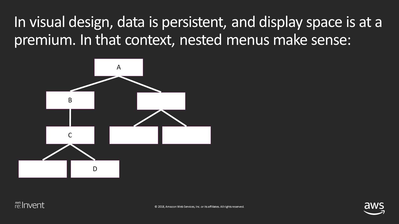
In visual design, data is persistent, and space is at a premium. Simultaneously presenting the user with every possible option can be overwhelming and confusing, and so organizational structures like nested menus make sense.
However, with voice, data is ephemeral, and there are no display limitations - consequently, as much as possible should be available to the user at any given time.
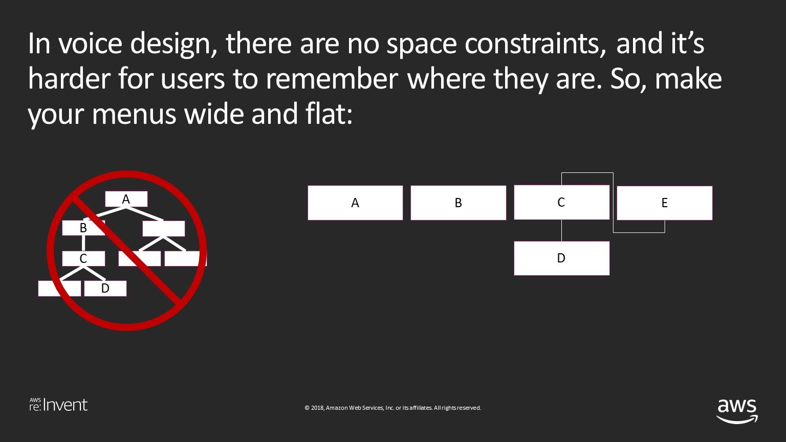
This can be a particularly pernicious problem with voice applications designed by those who built their careers in primarily visual mediums like web and mobile, and an extremely annoying problem for users.
For example, a while back Pulse Labs was testing a skill for ordering movie tickets. The first thing the skill asked the user to do was decide whether to search for movies by name, or by nearby theater. Once the user started down one path, they could not switch paths without going back to the beginning. For example:
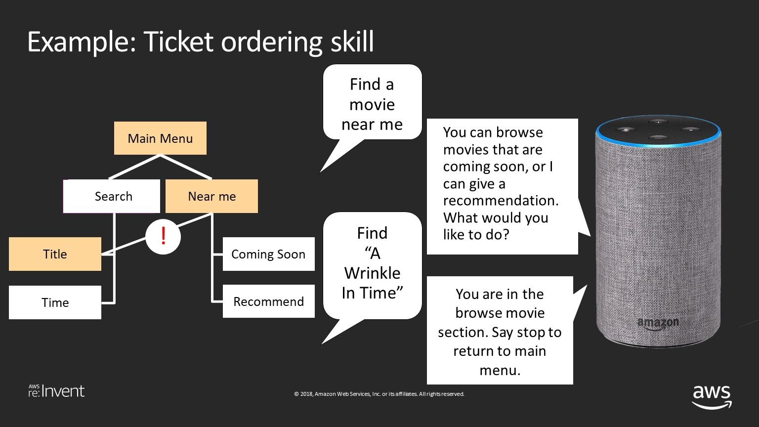
Would it be nice if when the user asked to find "A Wrinkle In Time" the skill just found "A Wrinkle In Time"? In another application, this one a food re-ordering restaurant application, a user couldn't ask to "change location" without first asking to "change something":
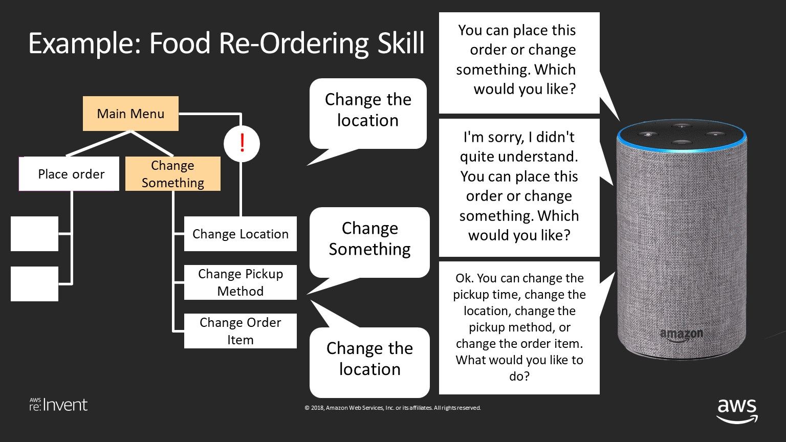
These were both very frustrating experiences for the user. They were also unnecessary, and were (thankfully) fixed before the applications launched.
Issues like these should be avoided at all cost, as they can wreck the user experience. The best way to catch issues like this is through user testing before you launch your application, and the best way to user test your voice application is with Pulse Labs.
I hope you've found this post, and this series, useful. Paul Cutsinger and I will be repeating our presentation from re:Invent at the 2019 Voice Conference in Chattanooga, Tennessee on Wednesday, January 16th at 10:30 AM (Session 224). We'd love to see you there!


